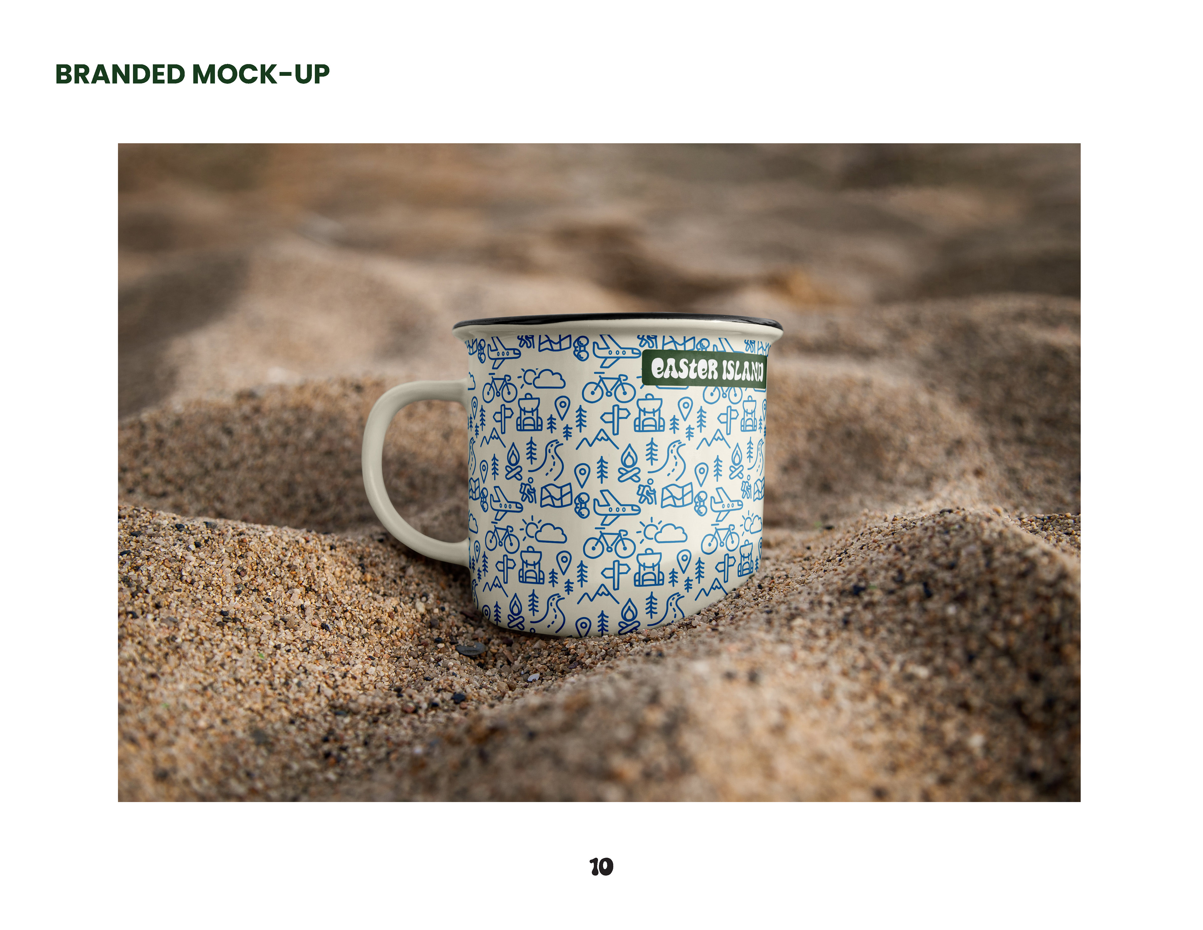

For this concept project, I designed a custom typographic mark for a fictional brand focused on responsible travel and nature preservation. The goal was to create a logo that captured the spirit of the brand—thoughtful, adventurous, and globally minded—using only type. No icons, no images—just letterforms doing all the talking.
This (fictional) company exists to inspire responsible travel. They run an online publication, collaborate with sustainable gear companies, and sell artisan-made products that give back to global communities. You’d find their products in outdoor stores, national parks, and online—basically, anywhere adventurous people shop.
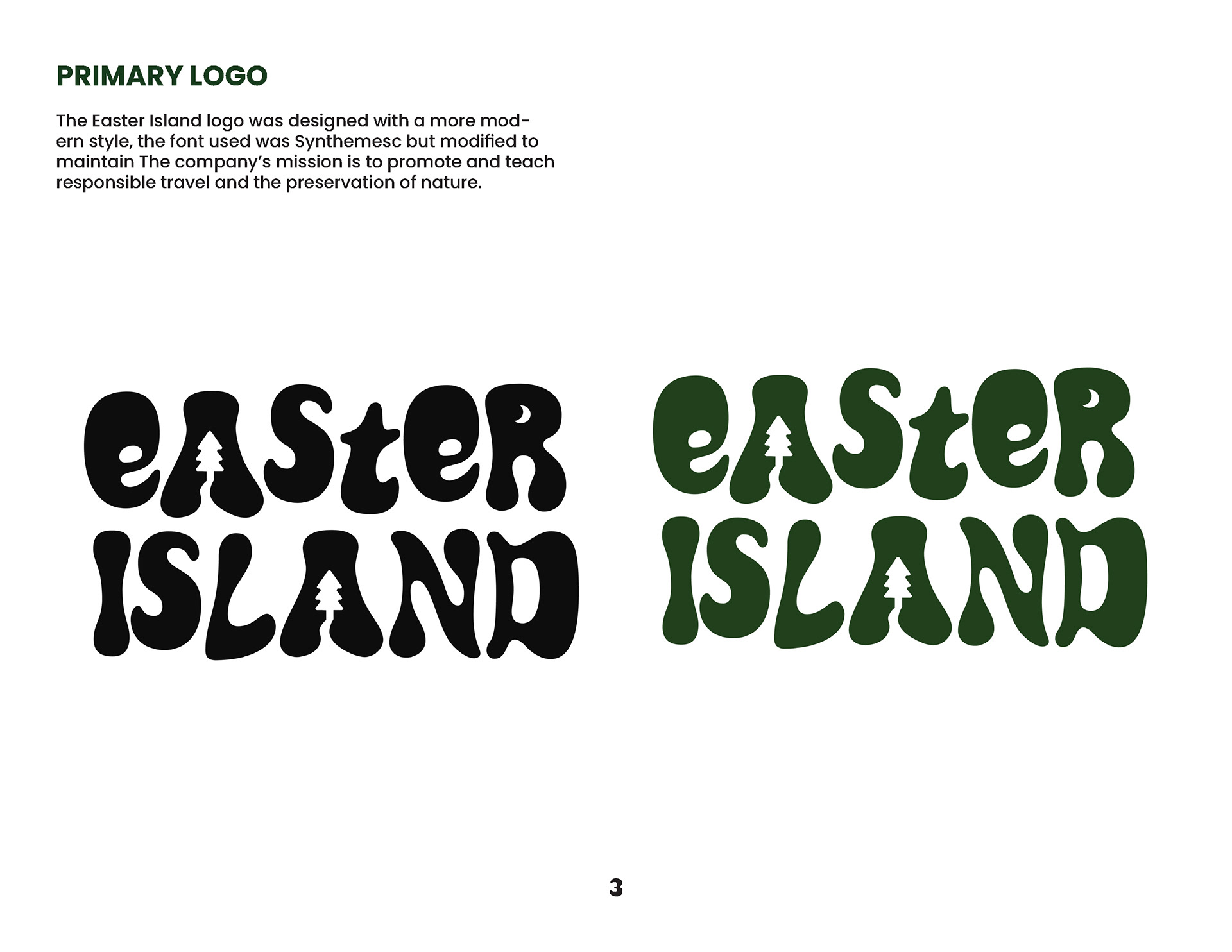


I used the concept of “type as image,” where the typography itself visually represents the idea behind the brand. Inspired by clever animal wordmarks we explored in class, I played with letter shapes to add meaning and personality to the mark.